Podium is a fitness app that lets you compete with other runners and cyclists around the world. Advance to new leagues and earn prizes as you exercise.
Role
UX+UI Design, Design Strategy, Research & Brand
Tools
Figma, Figjam, Illustrator
Timeframe
2 months
Problem
Despite the number of fitness apps available, many beginner athletes
struggle to stay motivated because they feel exercise isn’t fun.
Goal
Design & build an application that motivates runners & cyclists of all skill levels to get out and do their sport.
Use gamification to make physical activity more fun for beginners.
User Research
In order to better understand users’ needs, I reached out to ten different runners and cyclists who like to or currently use an app to track their activities.
Key Takeaways
The interviews were extremely insightful. From our research and interviews the key takeaways were:
People who are new to running or don’t run as seriously find activity-tracking apps lose their interest after a few sessions.
The same people stop using their tracking apps of choice after a few weeks.
Despite these facts, these same people want to keep running and/or cycling but lose the motivation to track or seek different activities (gym, etc.) altogether.
Long-term users who record activities regularly don’t spend as much using their app of choice as they did when they first joined.
Personas
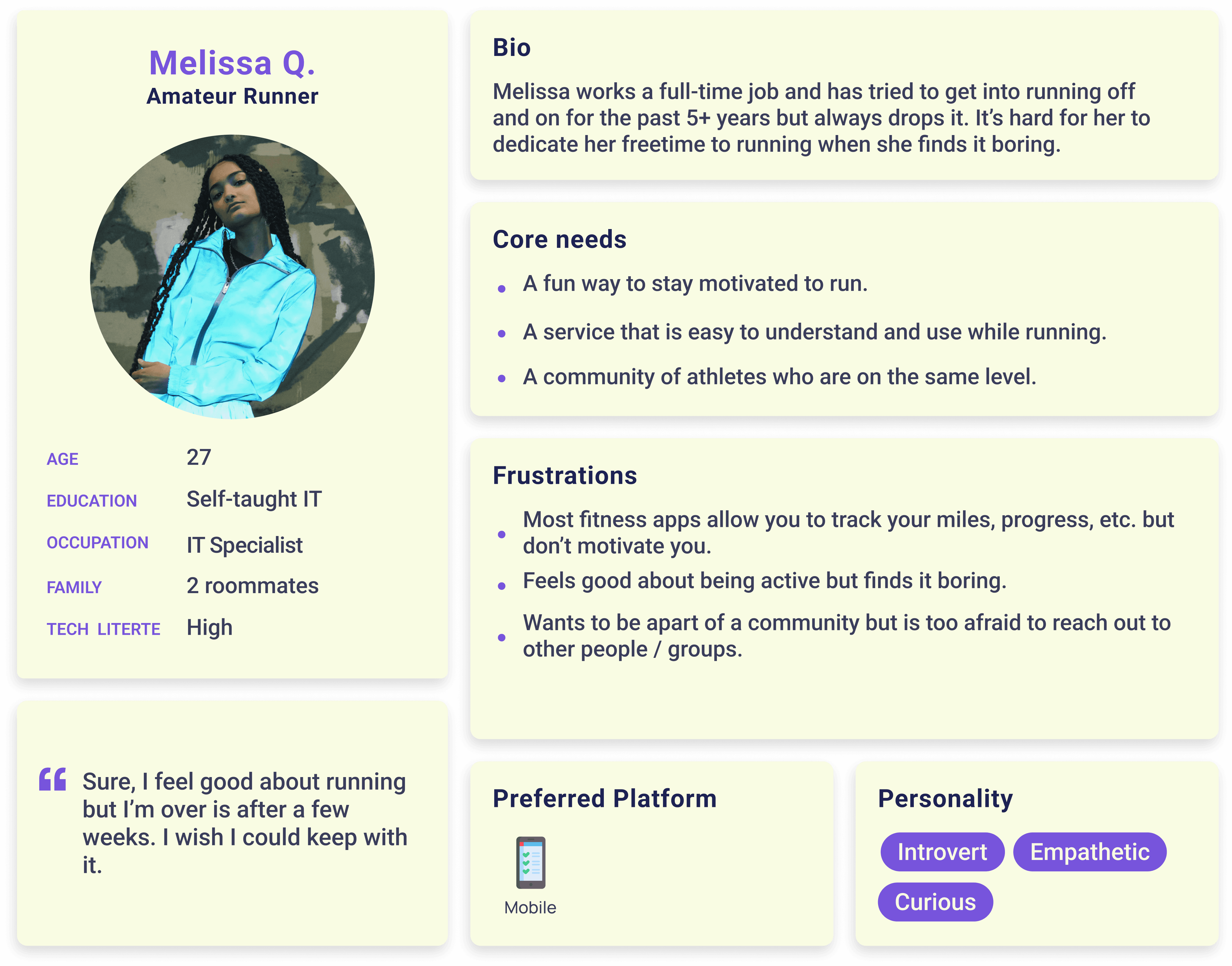
Using the data from my research, I created two personas.
Melissa is new to running and quickly loses motivation.
Greg is a semi-pro cyclist who wants more competition with his fitness apps.
User Journey
I then created a user journey that starts with the user searching for a
new running/cycling app, and goes through the different features. This
allowed me to start thinking about features and identify opportunities
and potential pain points.

Solutions & Design
In order to better understand users’ needs, I reached out to ten different runners and cyclists who like to or currently use an app to track their activities.
Features
After researching and interviewing potential users I sketched out the two main features.
01.00
Teams
Users join a team each month to compete against another team. They can create their own with friends or be placed on one with other runners/cyclists. If your team wins (or if you’re in the top spot of the losing team), you will be promoted to a new league; if you lose, you will be demoted. This is both used as a way to motivate users (new runners/cyclists) and as a way to stay competitive (for advanced runners/cyclists).
Users can also win badges, etc, for placing higher on their team, running the furthest, covering the most elevation, etc.

02.00
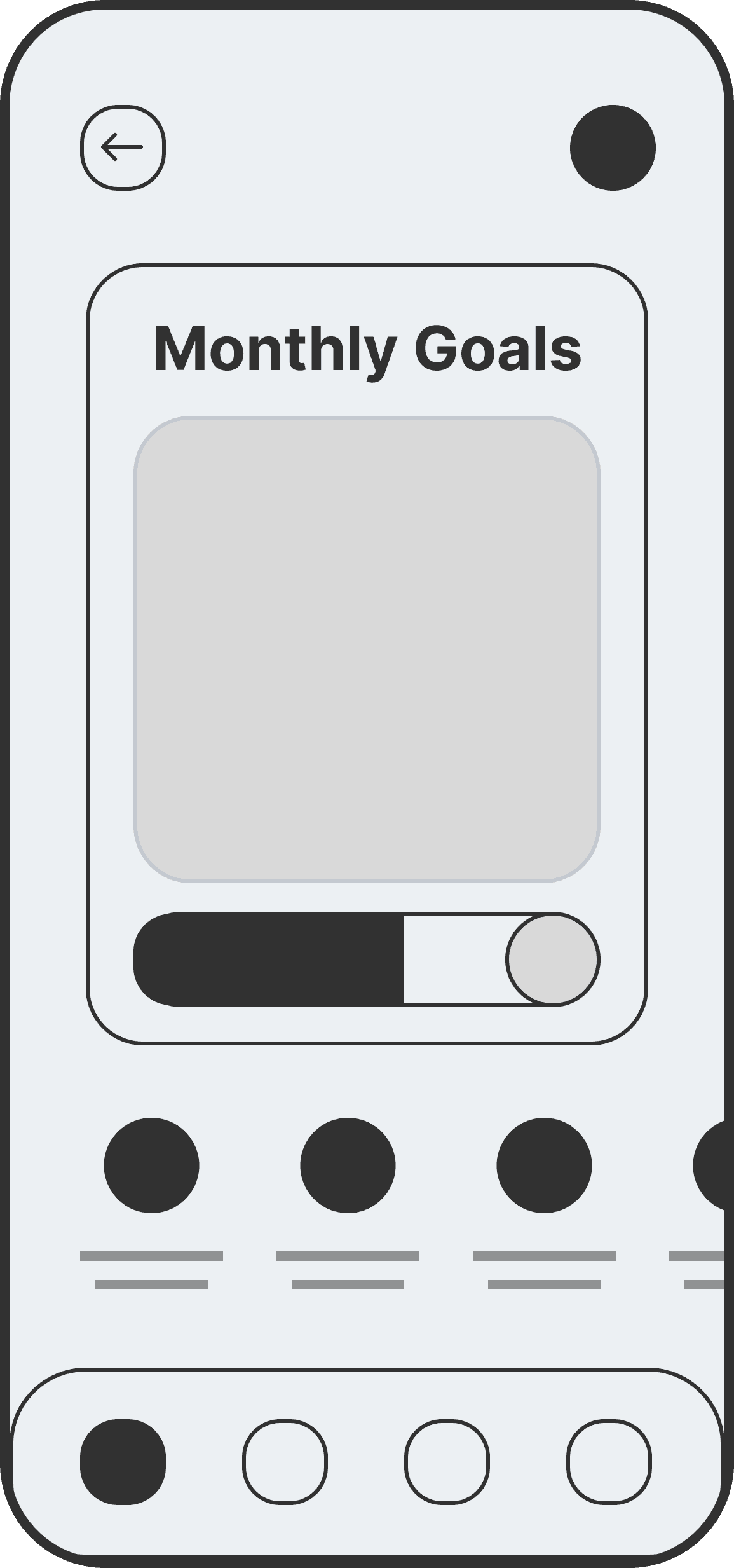
Goals
Within the app, there is an world that you explore using real-world running and cycling. Using real-world tracking, users will complete in-app/”game” tasks such as summiting a mountain. This is Podium’s take on weekly/monthly goals that are used to motivate users who like games, etc.
Task Flows
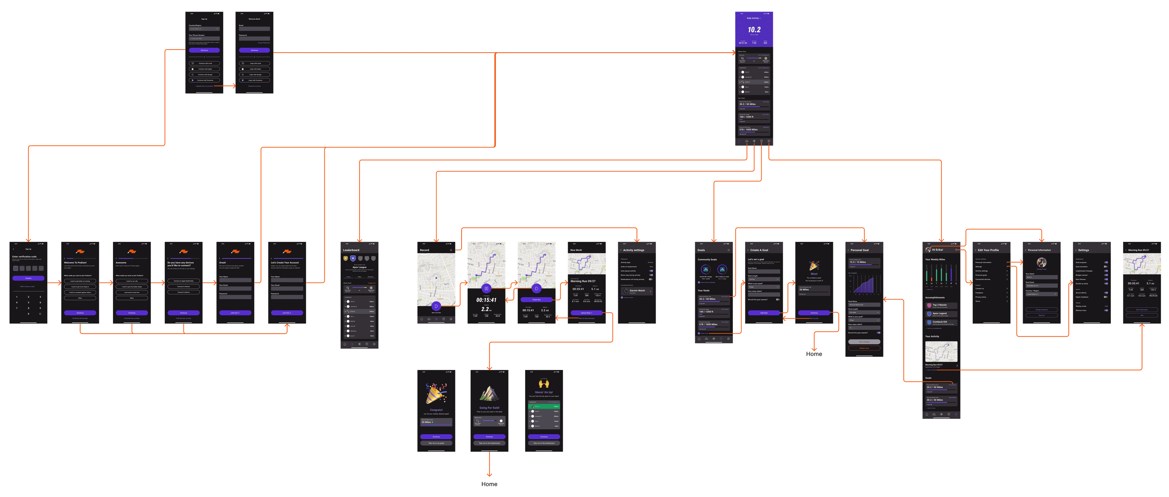
With feature concepts complete, I created site flows. Shown here is the user flow for signing in and recording an activity.

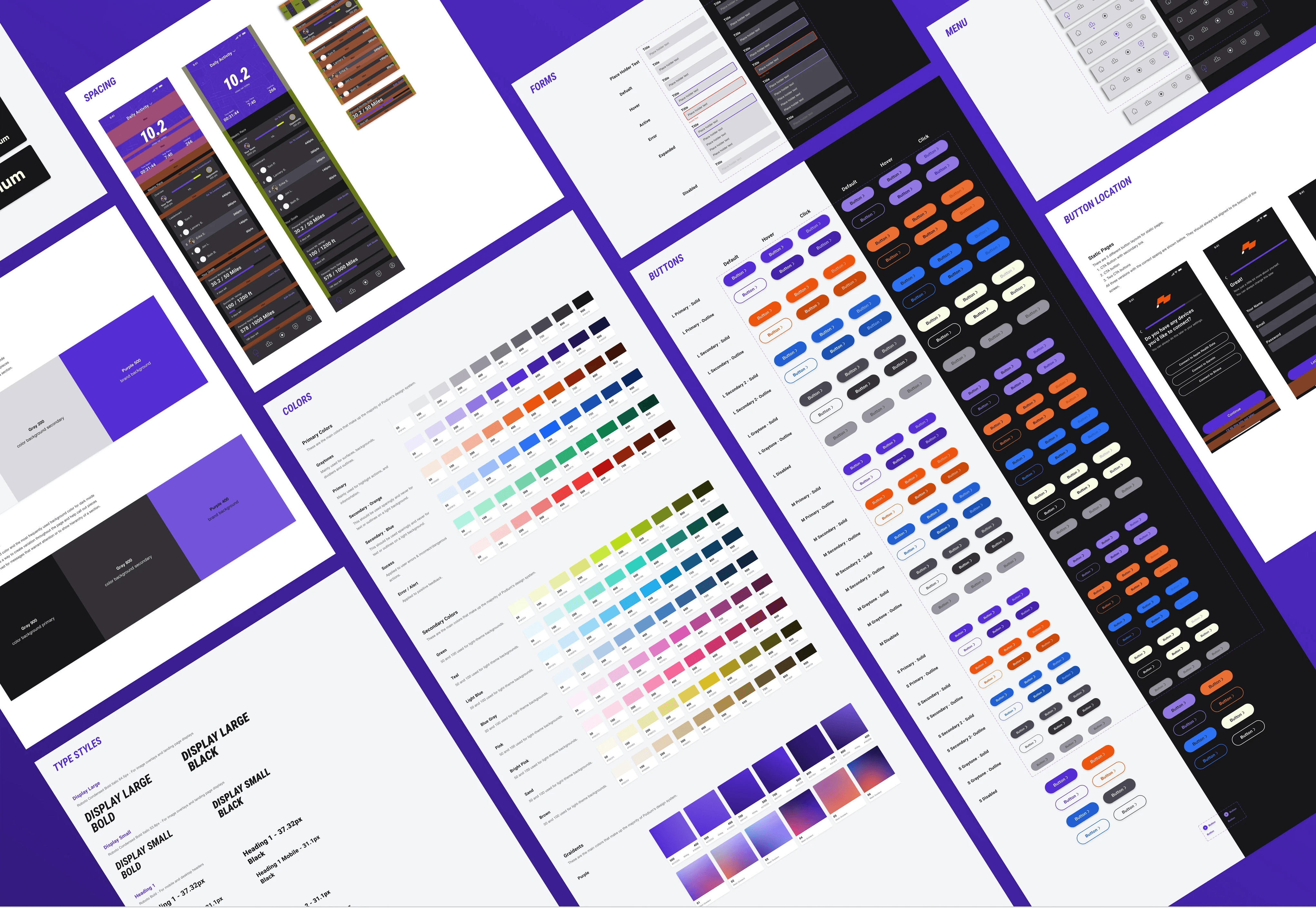
Design System
Once happy with the user flow, I took some time to build out the design system. This included colors for light and dark modes, logos, type styles, buttons, etc.
More information on the design system can be seen here.
Building + Testing
I created mockups for the app using the task flows and design system. I first started with low-fidelity mockups, using pen & paper, and thenmoved to mid-fidelity mockups. Once happy with the basic design, a prototype was built for users to test.
Usability Tests + Updated Wireframes
Before the final round of testing, I created a mid-fidelity prototype, came up with a list of tasks for users to complete, and held usability tests. Overall the feedback was positive, and users that fell into both persona categories believed this product would exceed their needs and keep them interested in staying active. I think this quote from one of the testers perfectly sums up what we were looking to achieve, “As someone who loves games and wants to love running, this seems like the perfect solution to get me off the couch!”
After receiving feedback from users, I made needed changes and cleaned up the design. Some of the changes that were made after testing can be seen in the final design section below.
Final Design
Following design revisions and the completion of a design system, I conducted several rounds of user testing, resulting in a high-fidelity prototype. Additionally, I prepared documentation for developer handoff.
The final prototype can be viewed here.
01.00
Teams
After running usability tests, I made changes to make this feature easier for users to understand and navigate.
Leaderboard Icons now include a color border to match the team color to help the user understand the team point progress bar.
Cards were made darker to help with text visibility.
The team point/progress bar was adjusted to help with readability.
The “white” used throughout the app was adjusted to improve readability. It is now WCAG compliant
02.00
Goals
Like in the original concept users still use real-world activity to complete tasks.
I added a feature that allows users to add their own personal goals. This was a feature that was requested by multiple people during usability testing.

03.00
Recording Activity
I decided to keep the data displayed simple. During usability tests users mentioned that other apps had confusing UX that was hard to view during an activity.
Users have the ability to connect other devices like fitness apps.
Within a user’s settings, they can add/remove fields that are visible during activity.

04.00
Onboarding
When signing up users are given a short survey which helps set up the app for their needs. Users are asked about their skill level, goals, and if they currently use other devices (Apple, Garmin, etc.). This helps ensure the best possible intro to Podium.
During user testing more experienced runners/cyclists wanted to see more information. With a short survey at sign up we’re able to adjust the default fields the user is shown.

Retrospective
The prototype showed proof of concept and proved that there is a void in the fitness space. Through design, strategy and research we were able to develop a concept that exceeded users expectations.
82%
of testers were able
to complete tasks
without assistance
78%
of athletes can see
themselves using
this app long-term
Want to see more?
Podium is a fitness app that lets you compete with other runners and cyclists around the world. Advance to new leagues and earn prizes as you exercise.
Role
UX+UI Design, Design Strategy, Research & Brand
Tools
Figma, Figjam, Illustrator
Timeframe
2 months
Problem
Despite the number of fitness apps available, many beginner athletes
struggle to stay motivated because they feel exercise isn’t fun.
Goal
Design & build an application that motivates runners & cyclists of all skill levels to get out and do their sport.
Use gamification to make physical activity more fun for beginners.
User Research
In order to better understand users’ needs, I reached out to ten different runners and cyclists who like to or currently use an app to track their activities.
Key Takeaways
The interviews were extremely insightful. From our research and interviews the key takeaways were:
People who are new to running or don’t run as seriously find activity-tracking apps lose their interest after a few sessions.
The same people stop using their tracking apps of choice after a few weeks.
Despite these facts, these same people want to keep running and/or cycling but lose the motivation to track or seek different activities (gym, etc.) altogether.
Long-term users who record activities regularly don’t spend as much using their app of choice as they did when they first joined.
Personas
Using the data from my research, I created two personas.
Melissa is new to running and quickly loses motivation.
Greg is a semi-pro cyclist who wants more competition with his fitness apps.
User Journey
I then created a user journey that starts with the user searching for a
new running/cycling app, and goes through the different features. This
allowed me to start thinking about features and identify opportunities
and potential pain points.
Solutions & Design
In order to better understand users’ needs, I reached out to ten different runners and cyclists who like to or currently use an app to track their activities.
Features
After researching and interviewing potential users I sketched out the two main features.
01.00
Teams
Users join a team each month to compete against another team. They can create their own with friends or be placed on one with other runners/cyclists. If your team wins (or if you’re in the top spot of the losing team), you will be promoted to a new league; if you lose, you will be demoted. This is both used as a way to motivate users (new runners/cyclists) and as a way to stay competitive (for advanced runners/cyclists).
Users can also win badges, etc, for placing higher on their team, running the furthest, covering the most elevation, etc.
02.00
Goals
Within the app, there is an world that you explore using real-world running and cycling. Using real-world tracking, users will complete in-app/”game” tasks such as summiting a mountain. This is Podium’s take on weekly/monthly goals that are used to motivate users who like games, etc.
Task Flows
With feature concepts complete, I created site flows. Shown here is the user flow for signing in and recording an activity.
Design System
Once happy with the user flow, I took some time to build out the design system. This included colors for light and dark modes, logos, type styles, buttons, etc.
More information on the design system can be seen here.
Building + Testing
I created mockups for the app using the task flows and design system. I first started with low-fidelity mockups, using pen & paper, and thenmoved to mid-fidelity mockups. Once happy with the basic design, a prototype was built for users to test.
Usability Tests + Updated Wireframes
Before the final round of testing, I created a mid-fidelity prototype, came up with a list of tasks for users to complete, and held usability tests. Overall the feedback was positive, and users that fell into both persona categories believed this product would exceed their needs and keep them interested in staying active. I think this quote from one of the testers perfectly sums up what we were looking to achieve, “As someone who loves games and wants to love running, this seems like the perfect solution to get me off the couch!”
After receiving feedback from users, I made needed changes and cleaned up the design. Some of the changes that were made after testing can be seen in the final design section below.
Final Design
Following design revisions and the completion of a design system, I conducted several rounds of user testing, resulting in a high-fidelity prototype. Additionally, I prepared documentation for developer handoff.
The final prototype can be viewed here.
01.00
Teams
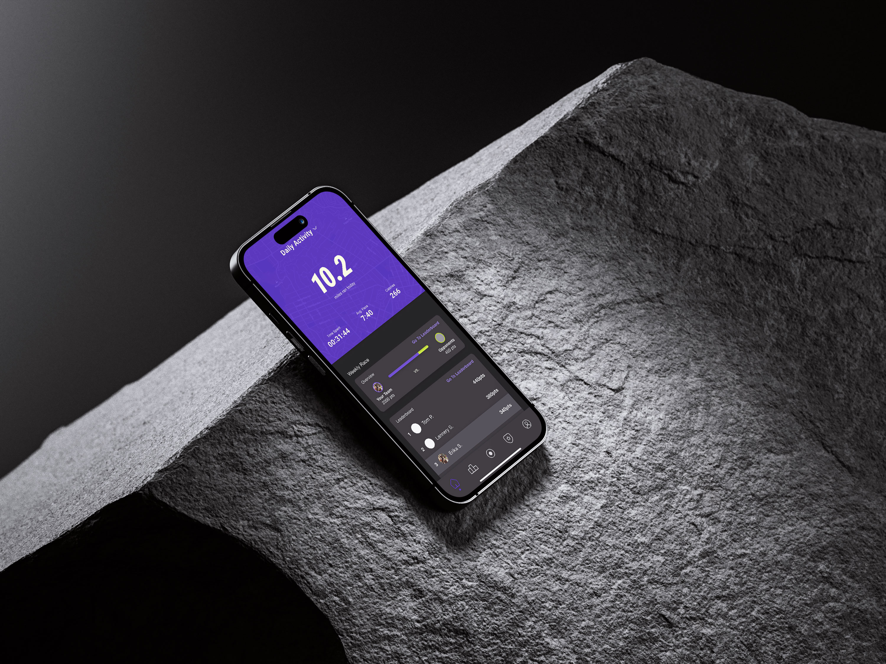
After running usability tests, I made changes to make this feature easier for users to understand and navigate.
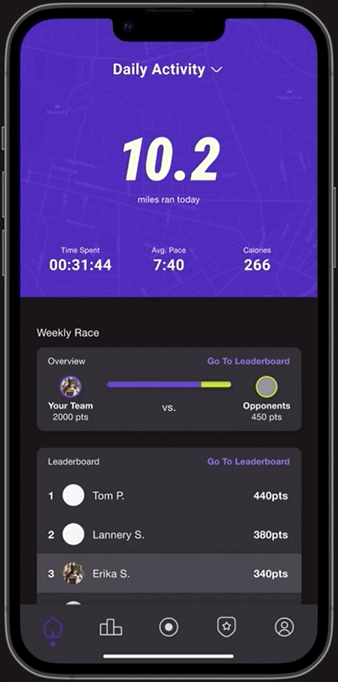
Leaderboard Icons now include a color border to match the team color to help the user understand the team point progress bar.
Cards were made darker to help with text visibility.
The team point/progress bar was adjusted to help with readability.
The “white” used throughout the app was adjusted to improve readability. It is now WCAG compliant
02.00
Goals
Like in the original concept users still use real-world activity to complete tasks.
I added a feature that allows users to add their own personal goals. This was a feature that was requested by multiple people during usability testing.
03.00
Recording Activity
I decided to keep the data displayed simple. During usability tests users mentioned that other apps had confusing UX that was hard to view during an activity.
Users have the ability to connect other devices like fitness apps.
Within a user’s settings, they can add/remove fields that are visible during activity.
04.00
Onboarding
When signing up users are given a short survey which helps set up the app for their needs. Users are asked about their skill level, goals, and if they currently use other devices (Apple, Garmin, etc.). This helps ensure the best possible intro to Podium.
During user testing more experienced runners/cyclists wanted to see more information. With a short survey at sign up we’re able to adjust the default fields the user is shown.
Retrospective
The prototype showed proof of concept and proved that there is a void in the fitness space. Through design, strategy and research we were able to develop a concept that exceeded users expectations.
82%
of testers were able
to complete tasks
without assistance
78%
of athletes can see
themselves using
this app long-term
Want to see more?
Podium is a fitness app that lets you compete with other runners and cyclists around the world. Advance to new leagues and earn prizes as you exercise.
Role
UX+UI Design, Design Strategy, Research & Brand
Tools
Figma, Figjam, Illustrator
Timeframe
2 months
Problem
Despite the number of fitness apps available, many beginner athletes
struggle to stay motivated because they feel exercise isn’t fun.
Goal
Design & build an application that motivates runners & cyclists of all skill levels to get out and do their sport.
Use gamification to make physical activity more fun for beginners.
User Research
In order to better understand users’ needs, I reached out to ten different runners and cyclists who like to or currently use an app to track their activities.
Key Takeaways
The interviews were extremely insightful. From our research and interviews the key takeaways were:
People who are new to running or don’t run as seriously find activity-tracking apps lose their interest after a few sessions.
The same people stop using their tracking apps of choice after a few weeks.
Despite these facts, these same people want to keep running and/or cycling but lose the motivation to track or seek different activities (gym, etc.) altogether.
Long-term users who record activities regularly don’t spend as much using their app of choice as they did when they first joined.
Personas
Using the data from my research, I created two personas.
Melissa is new to running and quickly loses motivation.
Greg is a semi-pro cyclist who wants more competition with his fitness apps.
User Journey
I then created a user journey that starts with the user searching for a new running/cycling app, and goes through the different features. This allowed me to start thinking about features and identify opportunities and potential pain points.
Solutions & Design
In order to better understand users’ needs, I reached out to ten different runners and cyclists who like to or currently use an app to track their activities.
Features
After researching and interviewing potential users I sketched out the two main features.
01.00
Teams
Users join a team each month to compete against another team. They can create their own with friends or be placed on one with other runners/cyclists. If your team wins (or if you’re in the top spot of the losing team), you will be promoted to a new league; if you lose, you will be demoted. This is both used as a way to motivate users (new runners/cyclists) and as a way to stay competitive (for advanced runners/cyclists).
Users can also win badges, etc, for placing higher on their team, running the furthest, covering the most elevation, etc.
02.00
Goals
Within the app, there is an world that you explore using real-world running and cycling. Using real-world tracking, users will complete in-app/”game” tasks such as summiting a mountain. This is Podium’s take on weekly/monthly goals that are used to motivate users who like games, etc.
Task Flows
With feature concepts complete, I created site flows. Shown here is the user flow for signing in and recording an activity.
Design System
Once happy with the user flow, I took some time to build out the design system. This included colors for light and dark modes, logos, type styles, buttons, etc.
More information on the design system can be seen here.
Building + Testing
I created mockups for the app using the task flows and design system. I first started with low-fidelity mockups, using pen & paper, and thenmoved to mid-fidelity mockups. Once happy with the basic design, a prototype was built for users to test.
Usability Tests + Updated Wireframes
Before the final round of testing, I created a mid-fidelity prototype, came up with a list of tasks for users to complete, and held usability tests. Overall the feedback was positive, and users that fell into both persona categories believed this product would exceed their needs and keep them interested in staying active. I think this quote from one of the testers perfectly sums up what we were looking to achieve, “As someone who loves games and wants to love running, this seems like the perfect solution to get me off the couch!”
After receiving feedback from users, I made needed changes and cleaned up the design. Some of the changes that were made after testing can be seen in the final design section below.
Final Design
Following design revisions and the completion of a design system, I conducted several rounds of user testing, resulting in a high-fidelity prototype. Additionally, I prepared documentation for developer handoff.
The final prototype can be viewed here.
01.00
Teams
After running usability tests, I made changes to make this feature easier for users to understand and navigate.
Leaderboard Icons now include a color border to match the team color to help the user understand the team point progress bar.
Cards were made darker to help with text visibility.
The team point/progress bar was adjusted to help with readability.
The “white” used throughout the app was adjusted to improve readability. It is now WCAG compliant
02.00
Goals
Like in the original concept users still use real-world activity to complete tasks.
I added a feature that allows users to add their own personal goals. This was a feature that was requested by multiple people during usability testing.
03.00
Recording Activity
I decided to keep the data displayed simple. During usability tests users mentioned that other apps had confusing UX that was hard to view during an activity.
Users have the ability to connect other devices like fitness apps.
Within a user’s settings, they can add/remove fields that are visible during activity.
04.00
Onboarding
When signing up users are given a short survey which helps set up the app for their needs. Users are asked about their skill level, goals, and if they currently use other devices (Apple, Garmin, etc.). This helps ensure the best possible intro to Podium.
During user testing more experienced runners/cyclists wanted to see more information. With a short survey at sign up we’re able to adjust the default fields the user is shown.
Retrospective
The prototype showed proof of concept and proved that there is a void in the fitness space. Through design, strategy and research we were able to develop a concept that exceeded users expectations.
82%
of testers were able
to complete tasks
without assistance
78%
of athletes can see
themselves using
this app long-term
Want to see more?
Podium is a fitness app that lets you compete with other runners and cyclists around the world. Advance to new leagues and earn prizes as you exercise.
Role
UX+UI Design, Design Strategy, Research & Brand
Tools
Figma, Figjam, Illustrator
Timeframe
2 months
Problem
Despite the number of fitness apps available, many beginner athletes
struggle to stay motivated because they feel exercise isn’t fun.
Goal
Design & build an application that motivates runners & cyclists of all skill levels to get out and do their sport.
Use gamification to make physical activity more fun for beginners.
User Research
In order to better understand users’ needs, I reached out to ten different runners and cyclists who like to or currently use an app to track their activities.
Key Takeaways
The interviews were extremely insightful. From our research and interviews the key takeaways were:
People who are new to running or don’t run as seriously find activity-tracking apps lose their interest after a few sessions.
The same people stop using their tracking apps of choice after a few weeks.
Despite these facts, these same people want to keep running and/or cycling but lose the motivation to track or seek different activities (gym, etc.) altogether.
Long-term users who record activities regularly don’t spend as much using their app of choice as they did when they first joined.
Personas
Using the data from my research, I created two personas.
Melissa is new to running and quickly loses motivation.
Greg is a semi-pro cyclist who wants more competition with his fitness apps.
User Journey
I then created a user journey that starts with the user searching for a
new running/cycling app, and goes through the different features. This
allowed me to start thinking about features and identify opportunities
and potential pain points.
Solutions & Design
In order to better understand users’ needs, I reached out to ten different runners and cyclists who like to or currently use an app to track their activities.
Features
After researching and interviewing potential users I sketched out the two main features.
01.00
Teams
Users join a team each month to compete against another team. They can create their own with friends or be placed on one with other runners/cyclists. If your team wins (or if you’re in the top spot of the losing team), you will be promoted to a new league; if you lose, you will be demoted. This is both used as a way to motivate users (new runners/cyclists) and as a way to stay competitive (for advanced runners/cyclists).
Users can also win badges, etc, for placing higher on their team, running the furthest, covering the most elevation, etc.
02.00
Goals
Within the app, there is an world that you explore using real-world running and cycling. Using real-world tracking, users will complete in-app/”game” tasks such as summiting a mountain. This is Podium’s take on weekly/monthly goals that are used to motivate users who like games, etc.
Task Flows
With feature concepts complete, I created site flows. Shown here is the user flow for signing in and recording an activity.
Design System
Once happy with the user flow, I took some time to build out the design system. This included colors for light and dark modes, logos, type styles, buttons, etc.
More information on the design system can be seen here.
Building + Testing
I created mockups for the app using the task flows and design system. I first started with low-fidelity mockups, using pen & paper, and thenmoved to mid-fidelity mockups. Once happy with the basic design, a prototype was built for users to test.
Usability Tests + Updated Wireframes
Before the final round of testing, I created a mid-fidelity prototype, came up with a list of tasks for users to complete, and held usability tests. Overall the feedback was positive, and users that fell into both persona categories believed this product would exceed their needs and keep them interested in staying active. I think this quote from one of the testers perfectly sums up what we were looking to achieve, “As someone who loves games and wants to love running, this seems like the perfect solution to get me off the couch!”
After receiving feedback from users, I made needed changes and cleaned up the design. Some of the changes that were made after testing can be seen in the final design section below.
Final Design
Following design revisions and the completion of a design system, I conducted several rounds of user testing, resulting in a high-fidelity prototype. Additionally, I prepared documentation for developer handoff.
The final prototype can be viewed here.
01.00
Teams
After running usability tests, I made changes to make this feature easier for users to understand and navigate.
Leaderboard Icons now include a color border to match the team color to help the user understand the team point progress bar.
Cards were made darker to help with text visibility.
The team point/progress bar was adjusted to help with readability.
The “white” used throughout the app was adjusted to improve readability. It is now WCAG compliant
02.00
Goals
Like in the original concept users still use real-world activity to complete tasks.
I added a feature that allows users to add their own personal goals. This was a feature that was requested by multiple people during usability testing.
03.00
Recording Activity
I decided to keep the data displayed simple. During usability tests users mentioned that other apps had confusing UX that was hard to view during an activity.
Users have the ability to connect other devices like fitness apps.
Within a user’s settings, they can add/remove fields that are visible during activity.
04.00
Onboarding
When signing up users are given a short survey which helps set up the app for their needs. Users are asked about their skill level, goals, and if they currently use other devices (Apple, Garmin, etc.). This helps ensure the best possible intro to Podium.
During user testing more experienced runners/cyclists wanted to see more information. With a short survey at sign up we’re able to adjust the default fields the user is shown.
The prototype showed proof of concept and proved that there is a void in the fitness space. Through design, strategy and research we were able to develop a concept that exceeded users expectations.
82%
of testers were able
to complete tasks
without assistance
78%
of athletes can see
themselves using
this app long-term
Want to see more?
Podium is a fitness app that lets you compete with other runners and cyclists around the world. Advance to new leagues and earn prizes as you exercise.
Role
UX+UI Design, Design Strategy, Research & Brand
Tools
Figma, Figjam, Illustrator
Timeframe
2 months
Problem
Despite the number of fitness apps available, many beginner athletes
struggle to stay motivated because they feel exercise isn’t fun.
Goal
Design & build an application that motivates runners & cyclists of all skill levels to get out and do their sport.
Use gamification to make physical activity more fun for beginners.
User Research
In order to better understand users’ needs, I reached out to ten different runners and cyclists who like to or currently use an app to track their activities.
Key Takeaways
The interviews were extremely insightful. From our research and interviews the key takeaways were:
People who are new to running or don’t run as seriously find activity-tracking apps lose their interest after a few sessions.
The same people stop using their tracking apps of choice after a few weeks.
Despite these facts, these same people want to keep running and/or cycling but lose the motivation to track or seek different activities (gym, etc.) altogether.
Long-term users who record activities regularly don’t spend as much using their app of choice as they did when they first joined.
Personas
Using the data from my research, I created two personas.
Melissa is new to running and quickly loses motivation.
Greg is a semi-pro cyclist who wants more competition with his fitness apps.
User Journey
I then created a user journey that starts with the user searching for a new running/cycling app, and goes through the different features. This allowed me to start thinking about features and identify opportunities and potential pain points.
Solutions & Design
In order to better understand users’ needs, I reached out to ten different runners and cyclists who like to or currently use an app to track their activities.
Features
After researching and interviewing potential users I sketched out the two main features.
01.00
Teams
Users join a team each month to compete against another team. They can create their own with friends or be placed on one with other runners/cyclists. If your team wins (or if you’re in the top spot of the losing team), you will be promoted to a new league; if you lose, you will be demoted. This is both used as a way to motivate users (new runners/cyclists) and as a way to stay competitive (for advanced runners/cyclists).
Users can also win badges, etc, for placing higher on their team, running the furthest, covering the most elevation, etc.
02.00
Goals
Within the app, there is an world that you explore using real-world running and cycling. Using real-world tracking, users will complete in-app/”game” tasks such as summiting a mountain. This is Podium’s take on weekly/monthly goals that are used to motivate users who like games, etc.
Task Flows
With feature concepts complete, I created site flows. Shown here is the user flow for signing in and recording an activity.
Design System
Once happy with the user flow, I took some time to build out the design system. This included colors for light and dark modes, logos, type styles, buttons, etc.
More information on the design system can be seen here.
Building + Testing
I created mockups for the app using the task flows and design system. I first started with low-fidelity mockups, using pen & paper, and thenmoved to mid-fidelity mockups. Once happy with the basic design, a prototype was built for users to test.
Usability Tests + Updated Wireframes
Before the final round of testing, I created a mid-fidelity prototype, came up with a list of tasks for users to complete, and held usability tests. Overall the feedback was positive, and users that fell into both persona categories believed this product would exceed their needs and keep them interested in staying active. I think this quote from one of the testers perfectly sums up what we were looking to achieve, “As someone who loves games and wants to love running, this seems like the perfect solution to get me off the couch!”
After receiving feedback from users, I made needed changes and cleaned up the design. Some of the changes that were made after testing can be seen in the final design section below.
Final Design
Following design revisions and the completion of a design system, I conducted several rounds of user testing, resulting in a high-fidelity prototype. Additionally, I prepared documentation for developer handoff.
The final prototype can be viewed here.
01.00
Teams
After running usability tests, I made changes to make this feature easier for users to understand and navigate.
Leaderboard Icons now include a color border to match the team color to help the user understand the team point progress bar.
Cards were made darker to help with text visibility.
The team point/progress bar was adjusted to help with readability.
The “white” used throughout the app was adjusted to improve readability. It is now WCAG compliant
02.00
Goals
Like in the original concept users still use real-world activity to complete tasks.
I added a feature that allows users to add their own personal goals. This was a feature that was requested by multiple people during usability testing.
03.00
Recording Activity
I decided to keep the data displayed simple. During usability tests users mentioned that other apps had confusing UX that was hard to view during an activity.
Users have the ability to connect other devices like fitness apps.
Within a user’s settings, they can add/remove fields that are visible during activity.
04.00
Onboarding
When signing up users are given a short survey which helps set up the app for their needs. Users are asked about their skill level, goals, and if they currently use other devices (Apple, Garmin, etc.). This helps ensure the best possible intro to Podium.
During user testing more experienced runners/cyclists wanted to see more information. With a short survey at sign up we’re able to adjust the default fields the user is shown.
Retrospective
The prototype showed proof of concept and proved that there is a void in the fitness space. Through design, strategy and research we were able to develop a concept that exceeded users expectations.
82%
of testers were able
to complete tasks
without assistance
78%
of athletes can see
themselves using
this app long-term
Want to see more?
Want to chat? Email me at
Made with love <3 . ©2024 Mike Tonkinson
Want to chat? Email me at
Made with love <3 . ©2024 Mike Tonkinson
Want to chat? Email me at
Made with love <3 . ©2024 Mike Tonkinson
Want to chat? Email me at
Made with love <3 . ©2024 Mike Tonkinson
Want to chat? Email me at
Made with love <3 . ©2024 Mike Tonkinson