
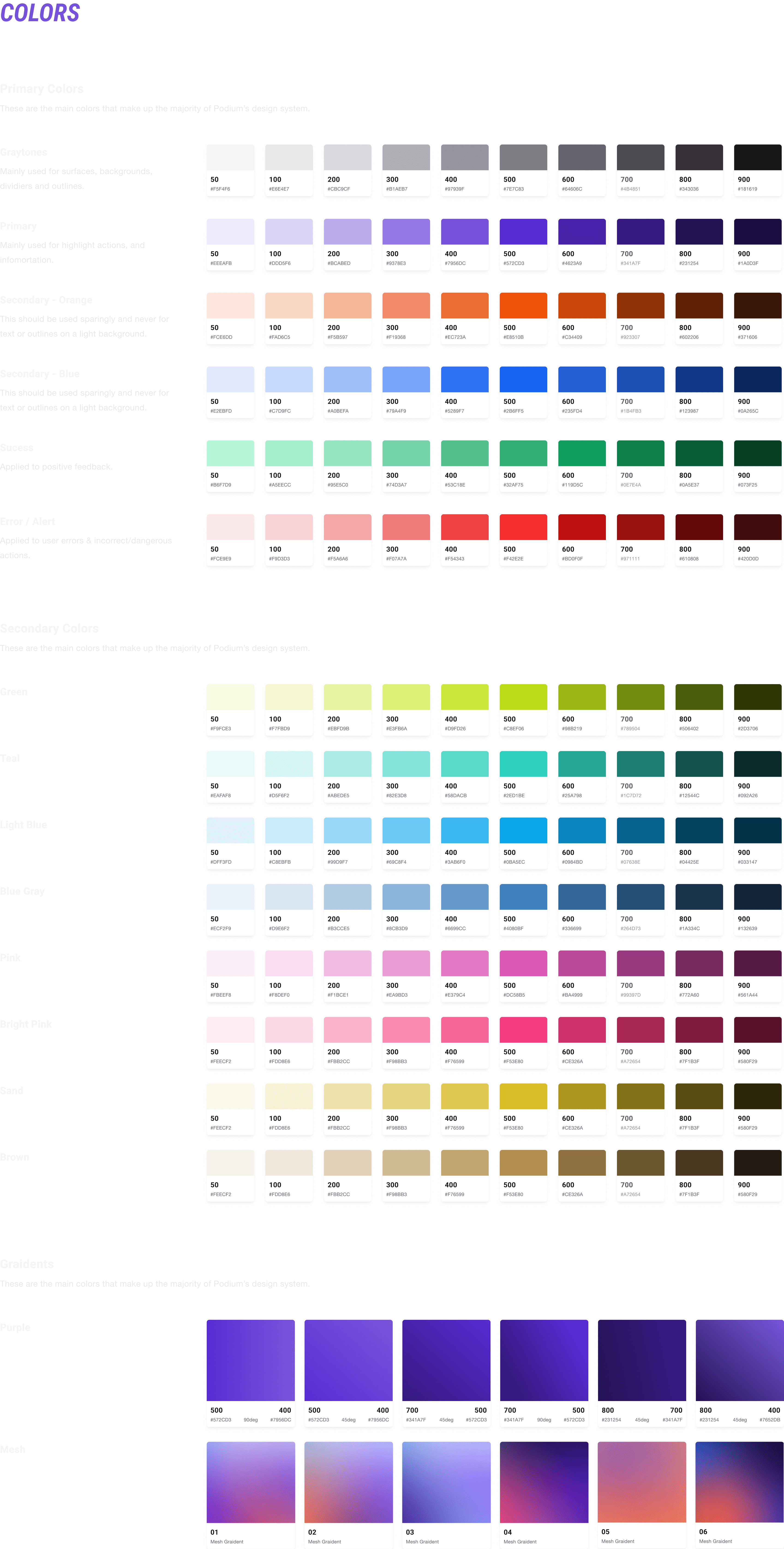
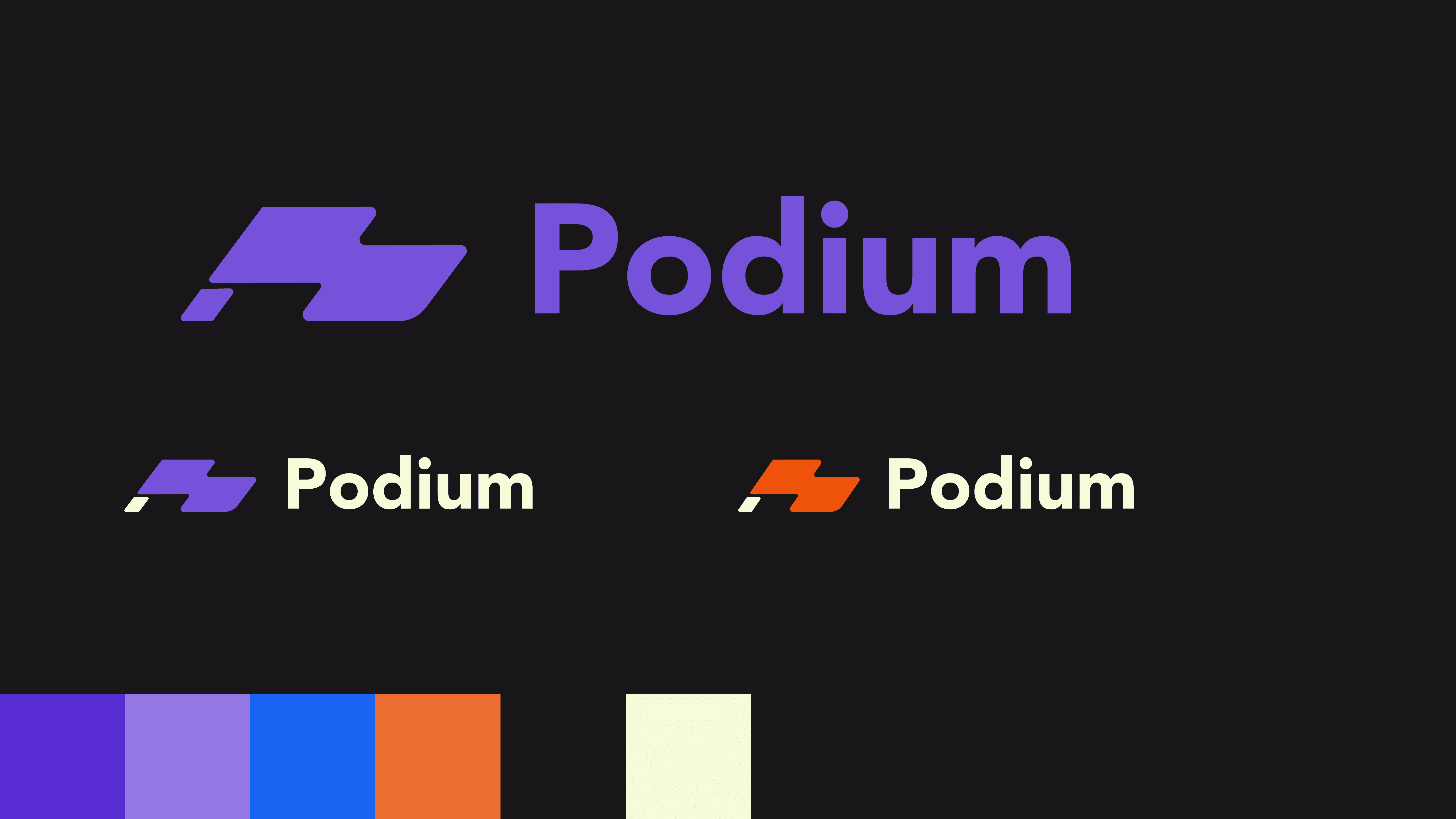
Color System
We built a color syste by incorporating primary, secondary, and gradient shades. The aim was to construct a lively and “fast-paced” palette. Each color combo was created to meet WCAG guidelines, ensuring accessibility for all users.
Typography
The typography follows the minor third scale and uses the Roboto family for displays and headers while using Helvetica Neue for the body.

Background Color Parings
Here are some color-paring rules for backgrounds for light and dark modes, including primary and secondary colors.

Button
Here is an example of the large buttons in the default, hover and click states

Want to see more?
Color System
We built a color syste by incorporating primary, secondary, and gradient shades. The aim was to construct a lively and “fast-paced” palette. Each color combo was created to meet WCAG guidelines, ensuring accessibility for all users.
Typography
I then created a user journey that starts with the user searching for a new running/cycling app, and goes through the different features. This allowed me to start thinking about features and identify opportunities and potential pain points.
Background Color Parings
Here are some color-paring rules for backgrounds for light and dark modes, including primary and secondary colors.
Button
Here is an example of the large buttons in the default, hover and click states
Want to see more?
Color System
We built a color syste by incorporating primary, secondary, and gradient shades. The aim was to construct a lively and “fast-paced” palette. Each color combo was created to meet WCAG guidelines, ensuring accessibility for all users.
Typography
The typography follows the minor third scale and uses the Roboto family for displays and headers while using Helvetica Neue for the body.
Background Color Parings
Here are some color-paring rules for backgrounds for light and dark modes, including primary and secondary colors.
Button
Here is an example of the large buttons in the default, hover and click states
Want to see more?
Color System
We built a color syste by incorporating primary, secondary, and gradient shades. The aim was to construct a lively and “fast-paced” palette. Each color combo was created to meet WCAG guidelines, ensuring accessibility for all users.
Typography
I then created a user journey that starts with the user searching for a new running/cycling app, and goes through the different features. This allowed me to start thinking about features and identify opportunities and potential pain points.
Background Color Parings
Here are some color-paring rules for backgrounds for light and dark modes, including primary and secondary colors.
Button
Here is an example of the large buttons in the default, hover and click states
Want to see more?
Color System
We built a color syste by incorporating primary, secondary, and gradient shades. The aim was to construct a lively and “fast-paced” palette. Each color combo was created to meet WCAG guidelines, ensuring accessibility for all users.
Typography
The typography follows the minor third scale and uses the Roboto family for displays and headers while using Helvetica Neue for the body.
Background Color Parings
Here are some color-paring rules for backgrounds for light and dark modes, including primary and secondary colors.
Button
Here is an example of the large buttons in the default, hover and click states
Want to see more?
Want to chat? Email me at
Made with love <3 . ©2024 Mike Tonkinson
Want to chat? Email me at
Made with love <3 . ©2024 Mike Tonkinson
Want to chat? Email me at
Made with love <3 . ©2024 Mike Tonkinson
Want to chat? Email me at
Made with love <3 . ©2024 Mike Tonkinson
Want to chat? Email me at
Made with love <3 . ©2024 Mike Tonkinson